Bootstrap 5 Scrollspy, Scrollspy plugin, the auto-update navigation plugin, will automatically update the corresponding navigation target based on the position of the scrollbar. The basic implementation is to scroll with you.
How to create Scrollspy
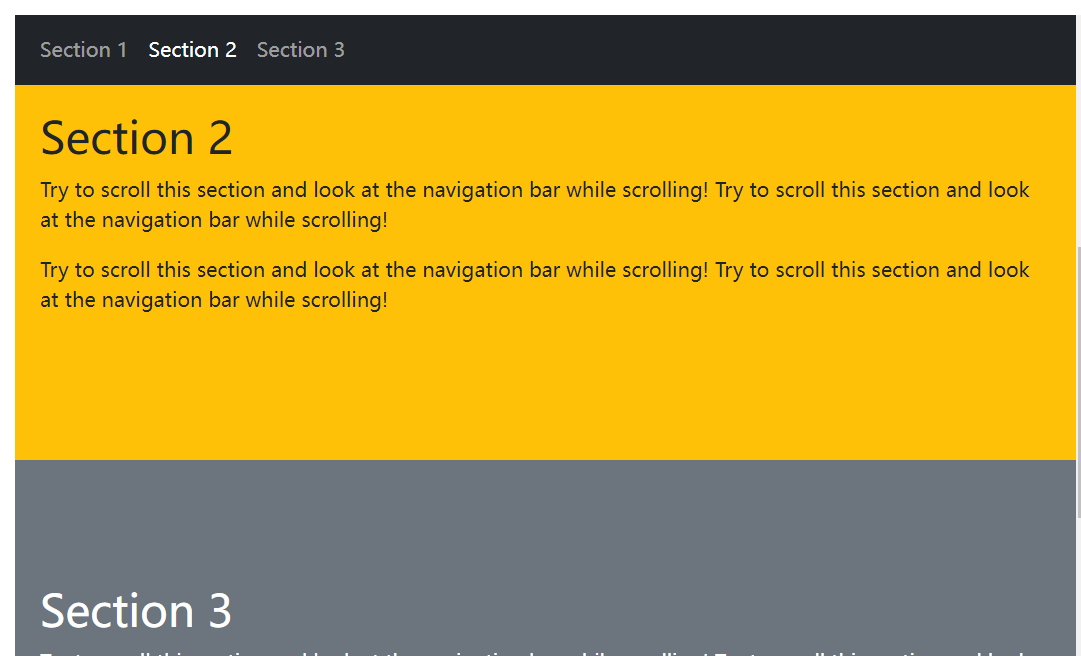
The following example demonstrates how to create a Scrollspy:
<!DOCTYPE html>
<html>
<head>
  <title>Bootstrap5 Demos</title>
  <meta charset="utf-8">
  <meta name="viewport" content="width=device-width, initial-scale=1">
  <link href="https://cdn.staticfile.org/twitter-bootstrap/5.1.1/css/bootstrap.min.css" rel="stylesheet">
  <script src="https://cdn.staticfile.org/twitter-bootstrap/5.1.1/js/bootstrap.bundle.min.js"></script>
</head>
<body data-bs-spy="scroll" data-bs-target=".navbar" data-bs-offset="50">

<nav class="navbar navbar-expand-sm bg-dark navbar-dark fixed-top">
  <div class="container-fluid">
    <ul class="navbar-nav">
      <li class="nav-item">
        <a class="nav-link" href="#section1">Section 1</a>
      </li>
      <li class="nav-item">
        <a class="nav-link" href="#section2">Section 2</a>
      </li>
      <li class="nav-item">
        <a class="nav-link" href="#section3">Section 3</a>
      </li>
    </ul>
  </div>
</nav>

<div id="section1" class="container-fluid bg-success text-white" style="padding:100px 20px;">
  <h1>Section 1</h1>
  <p>Try to scroll this section and look at the navigation bar while scrolling! Try to scroll this section and look at the navigation bar while scrolling!</p>
  <p>Try to scroll this section and look at the navigation bar while scrolling! Try to scroll this section and look at the navigation bar while scrolling!</p>
</div>

<div id="section2" class="container-fluid bg-warning" style="padding:100px 20px;">
  <h1>Section 2</h1>
  <p>Try to scroll this section and look at the navigation bar while scrolling! Try to scroll this section and look at the navigation bar while scrolling!</p>
  <p>Try to scroll this section and look at the navigation bar while scrolling! Try to scroll this section and look at the navigation bar while scrolling!</p>
</div>

<div id="section3" class="container-fluid bg-secondary text-white" style="padding:100px 20px;">
  <h1>Section 3</h1>
  <p>Try to scroll this section and look at the navigation bar while scrolling! Try to scroll this section and look at the navigation bar while scrolling!</p>
  <p>Try to scroll this section and look at the navigation bar while scrolling! Try to scroll this section and look at the navigation bar while scrolling!</p>
</div>

</body>
</html>
Output:

Scrollspy Example
Add data-bs-spy="scroll" to the element you want to listen to (usually the body).
Then add the data-bs-target property, which takes the value of the id or class (.navbar) of the navigation bar. This will link the scrollable area.
Note that the id (<div id="section1">) on the scrollable item element must match the link option (<a href="#section1">) on the navigation bar.
The optional data-bs-offset property is used to calculate the offset in pixels from the top when scrolling position. The default is 10 px.
Set relative positioning: Elements that use
data-spy="scroll"need to have their CSSpositionproperty set to"relative"in order to work.
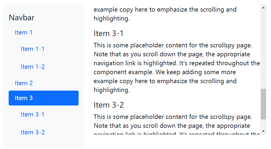
The following example sets up a vertical Scrollspy.
<!DOCTYPE html>
<html>
<head>
  <title>Bootstrap5 demos</title>
  <meta charset="utf-8">
  <meta name="viewport" content="width=device-width, initial-scale=1">
  <link href="https://cdn.staticfile.org/twitter-bootstrap/5.1.1/css/bootstrap.min.css" rel="stylesheet">
  <script src="https://cdn.staticfile.org/twitter-bootstrap/5.1.1/js/bootstrap.bundle.min.js"></script>
</head>
<style>
.scrollspy-example-2 {
    position: relative;
    height: 350px;
    overflow: auto;
}
</style>
<body >

<div class="row">
    <div class="col-4">
        <nav id="navbar-example3" class="navbar navbar-light bg-light flex-column align-items-stretch p-3">
            <a class="navbar-brand" href="#">Navbar</a>
            <nav class="nav nav-pills flex-column">
                <a class="nav-link" href="#item-1">Item 1</a>
                <nav class="nav nav-pills flex-column">
                    <a class="nav-link ms-3 my-1" href="#item-1-1">Item 1-1</a>
                    <a class="nav-link ms-3 my-1" href="#item-1-2">Item 1-2</a>
                </nav>
                <a class="nav-link" href="#item-2">Item 2</a>
                <a class="nav-link active" href="#item-3">Item 3</a>
                <nav class="nav nav-pills flex-column">
                    <a class="nav-link ms-3 my-1" href="#item-3-1">Item 3-1</a>
                    <a class="nav-link ms-3 my-1 active" href="#item-3-2">Item 3-2</a>
                </nav>
            </nav>
        </nav>
    </div>
    <div class="col-8">
        <div data-bs-spy="scroll" data-bs-target="#navbar-example3" data-bs-offset="0" class="scrollspy-example-2" tabindex="0">
            <h4 id="item-1">Item 1</h4>
            <p>This is some placeholder content for the scrollspy page. Note that as you scroll down the page, the appropriate navigation link is highlighted. It's repeated throughout the component example. We keep adding some more example copy here to emphasize the scrolling and highlighting.</p>
            <h5 id="item-1-1">Item 1-1</h5>
            <p>This is some placeholder content for the scrollspy page. Note that as you scroll down the page, the appropriate navigation link is highlighted. It's repeated throughout the component example. We keep adding some more example copy here to emphasize the scrolling and highlighting.</p>
            <h5 id="item-1-2">Item 1-2</h5>
            <p>This is some placeholder content for the scrollspy page. Note that as you scroll down the page, the appropriate navigation link is highlighted. It's repeated throughout the component example. We keep adding some more example copy here to emphasize the scrolling and highlighting.</p>
            <h4 id="item-2">Item 2</h4>
            <p>This is some placeholder content for the scrollspy page. Note that as you scroll down the page, the appropriate navigation link is highlighted. It's repeated throughout the component example. We keep adding some more example copy here to emphasize the scrolling and highlighting.</p>
            <h4 id="item-3">Item 3</h4>
            <p>This is some placeholder content for the scrollspy page. Note that as you scroll down the page, the appropriate navigation link is highlighted. It's repeated throughout the component example. We keep adding some more example copy here to emphasize the scrolling and highlighting.</p>
            <h5 id="item-3-1">Item 3-1</h5>
            <p>This is some placeholder content for the scrollspy page. Note that as you scroll down the page, the appropriate navigation link is highlighted. It's repeated throughout the component example. We keep adding some more example copy here to emphasize the scrolling and highlighting.</p>
            <h5 id="item-3-2">Item 3-2</h5>
            <p>This is some placeholder content for the scrollspy page. Note that as you scroll down the page, the appropriate navigation link is highlighted. It's repeated throughout the component example. We keep adding some more example copy here to emphasize the scrolling and highlighting.</p>
        </div>
    </div>
</div>
</body>
</html>
Output:

List group form
<!DOCTYPE html>
<html>
<head>
  <title>Bootstrap5 demos</title>
  <meta charset="utf-8">
  <meta name="viewport" content="width=device-width, initial-scale=1">
  <link href="https://cdn.staticfile.org/twitter-bootstrap/5.1.1/css/bootstrap.min.css" rel="stylesheet">
  <script src="https://cdn.staticfile.org/twitter-bootstrap/5.1.1/js/bootstrap.bundle.min.js"></script>
</head>
<style>
.scrollspy-example {
    position: relative;
    height: 200px;
    margin-top: .5rem;
    overflow: auto;
}
</style>
<body >

<div class="row">
    <div class="col-4">
        <div id="list-example" class="list-group">
            <a class="list-group-item list-group-item-action" href="#list-item-1">Item 1</a>
            <a class="list-group-item list-group-item-action" href="#list-item-2">Item 2</a>
            <a class="list-group-item list-group-item-action" href="#list-item-3">Item 3</a>
            <a class="list-group-item list-group-item-action active" href="#list-item-4">Item 4</a>
        </div>
    </div>
    <div class="col-8">
        <div data-bs-spy="scroll" data-bs-target="#list-example" data-bs-offset="0" class="scrollspy-example" tabindex="0">
            <h4 id="list-item-1">Item 1</h4>
            <p>This is some placeholder content for the scrollspy page. Note that as you scroll down the page, the appropriate navigation link is highlighted. It's repeated throughout the component example. We keep adding some more example copy here to emphasize the scrolling and highlighting.</p>
            <h4 id="list-item-2">Item 2</h4>
            <p>This is some placeholder content for the scrollspy page. Note that as you scroll down the page, the appropriate navigation link is highlighted. It's repeated throughout the component example. We keep adding some more example copy here to emphasize the scrolling and highlighting.</p>
            <h4 id="list-item-3">Item 3</h4>
            <p>This is some placeholder content for the scrollspy page. Note that as you scroll down the page, the appropriate navigation link is highlighted. It's repeated throughout the component example. We keep adding some more example copy here to emphasize the scrolling and highlighting.</p>
            <h4 id="list-item-4">Item 4</h4>
            <p>This is some placeholder content for the scrollspy page. Note that as you scroll down the page, the appropriate navigation link is highlighted. It's repeated throughout the component example. We keep adding some more example copy here to emphasize the scrolling and highlighting.</p>
        </div>
    </div>
</div>
</body>
</html>
Output:

 ApiDemos™