 ApiDemos™
Bootstrap 5 Collapse,Bootstrap5 collapse makes it easy to show and hide content.
<!DOCTYPE html>
<html>
<head>
<title>Bootstrap5 demo</title>
<meta charset="utf-8">
<meta name="viewport" content="width=device-width, initial-scale=1">
<link href="https://cdn.staticfile.org/twitter-bootstrap/5.1.1/css/bootstrap.min.css" rel="stylesheet">
<script src="https://cdn.staticfile.org/twitter-bootstrap/5.1.1/js/bootstrap.bundle.min.js"></script>
</head>
<body>
<div class="container mt-3">
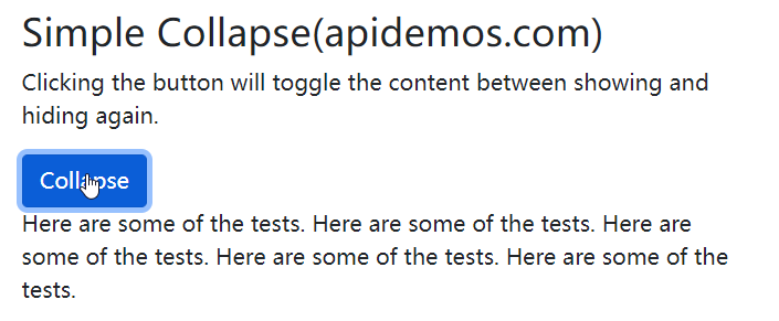
<h2>Simple Collapse(apidemos.com)</h2>
<p>Clicking the button will toggle the content between showing and hiding again.</p>
<button type="button" class="btn btn-primary" data-bs-toggle="collapse" data-bs-target="#demo">Collapse</button>
<div id="demo" class="collapse">
Here are some of the tests. Here are some of the tests. Here are some of the tests. Here are some of the tests. Here are some of the tests.
</div>
</div>
</body>
</html>Output:
Case Study
The .collapse class is used to specify a collapse element (<div> in the example); clicking the button will toggle between hidden and shown.
To control the hiding and showing of content, add the data-bs-toggle="collapse" attribute to the <a> or <button> element. The data-target="#id" attribute is the content that corresponds to the collapse (<div id="demo">).
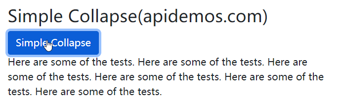
Note: You can use the href attribute on the <a> element instead of the data-bs-target attribute:
<!DOCTYPE html>
<html>
<head>
  <title>Bootstrap5 demo</title>
  <meta charset="utf-8">
  <meta name="viewport" content="width=device-width, initial-scale=1">
  <link href="https://cdn.staticfile.org/twitter-bootstrap/5.1.1/css/bootstrap.min.css" rel="stylesheet">
  <script src="https://cdn.staticfile.org/twitter-bootstrap/5.1.1/js/bootstrap.bundle.min.js"></script>
</head>
<body>

<div class="container mt-3">
  <h2>Simple Collapse(apidemos.com)</h2>
  <a href="#demo" class="btn btn-primary" data-bs-toggle="collapse">Simple Collapse</a>
  <div id="demo" class="collapse">
    Here are some of the tests. Here are some of the tests. Here are some of the tests. Here are some of the tests. Here are some of the tests. Here are some of the tests.
  </div>
</div>

</body>
</html>
Output:
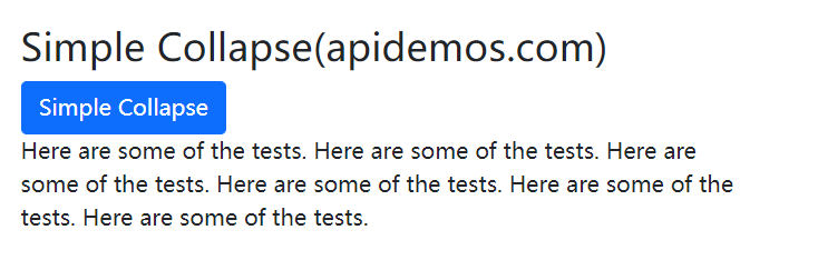
By default the contents of collapse are hidden, you can add the .show class to make the contents visible by default:
<!DOCTYPE html>
<html>
<head>
  <title>Bootstrap5 demos</title>
  <meta charset="utf-8">
  <meta name="viewport" content="width=device-width, initial-scale=1">
  <link href="https://cdn.staticfile.org/twitter-bootstrap/5.1.1/css/bootstrap.min.css" rel="stylesheet">
  <script src="https://cdn.staticfile.org/twitter-bootstrap/5.1.1/js/bootstrap.bundle.min.js"></script>
</head>
<body>

<div class="container mt-3">
  <h2>Simple Collapse(apidemos.com)</h2>
  <a href="#demo" class="btn btn-primary" data-bs-toggle="collapse">Simple Collapse</a>
  <div id="demo" class="collapse show">
    Here are some of the tests. Here are some of the tests. Here are some of the tests. Here are some of the tests. Here are some of the tests. Here are some of the tests.
  </div>
</div>

</body>
</html>
Output:
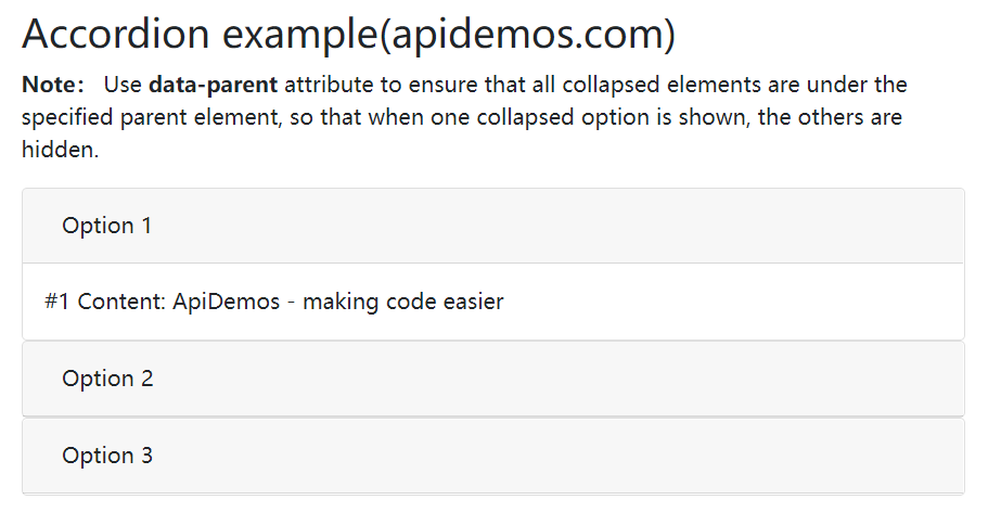
The following example displays a simple accordion by extending the card component.
Note: Use the data-bs-parent attribute to ensure that all collapse elements are under the specified parent element, so that the other options are hidden when one collapse option is shown.
<!DOCTYPE html>
<html>
<head>
  <title>Bootstrap5 demos</title>
  <meta charset="utf-8">
  <meta name="viewport" content="width=device-width, initial-scale=1">
  <link href="https://cdn.staticfile.org/twitter-bootstrap/5.1.1/css/bootstrap.min.css" rel="stylesheet">
  <script src="https://cdn.staticfile.org/twitter-bootstrap/5.1.1/js/bootstrap.bundle.min.js"></script>
</head>
<body>

<div class="container mt-3">
    <h2>Accordion example(apidemos.com)</h2>
   <p><strong>Note:</strong> Use <strong>data-parent</strong> attribute to ensure that all collapsed elements are under the specified parent element, so that when one collapsed option is shown, the others are hidden.</p>

    <div id="accordion">
        <div class="card">
            <div class="card-header">
                <a class="btn" data-bs-toggle="collapse" href="#collapseOne">
                Option 1
                </a>
            </div>
            <div id="collapseOne" class="collapse show" data-bs-parent="#accordion">
                <div class="card-body">
                #1 Content: ApiDemos - making code easier
                </div>
            </div>
        </div>
        <div class="card">
            <div class="card-header">
                <a class="collapsed btn" data-bs-toggle="collapse" href="#collapseTwo">
                Option 2
            </a>
            </div>
             <div id="collapseTwo" class="collapse" data-bs-parent="#accordion">
                <div class="card-body">
                #2 Content: ApiDemos - making code easier!
                </div>
            </div>
        </div>
        <div class="card">
            <div class="card-header">
                <a class="collapsed btn" data-bs-toggle="collapse" href="#collapseThree">
                Option 3
                </a>
            </div>
            <div id="collapseThree" class="collapse" data-bs-parent="#accordion">
                <div class="card-body">
                #3 Content: ApiDemos - making code easier!
                </div>
            </div>
        </div>
    </div>
</div>

</body>
</html>
Output: