 ApiDemos™
Bootstrap 5 Alerts
Bootstrap 5 makes it easy to implement the alert message boxes.
Alert boxes can be implemented using the .alert class, followed by the .alert-success, .alert-info, .alert-warning, .alert-danger, .alert-primary, .alert- secondary, .alert-light or .alert-dark classes to implement:
<!DOCTYPE html>
<html>
<head>
<title>Bootstrap5 demos</title>
<meta charset="utf-8">
<meta name="viewport" content="width=device-width, initial-scale=1">
<link href="https://cdn.staticfile.org/twitter-bootstrap/5.1.1/css/bootstrap.min.css" rel="stylesheet">
<script src="https://cdn.staticfile.org/twitter-bootstrap/5.1.1/js/bootstrap.bundle.min.js"></script>
</head>
<body>
<div class="container mt-3">
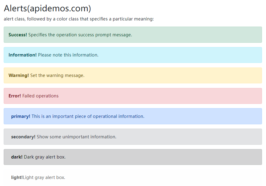
<h2>Alerts(apidemos.com)</h2>
<p>alert class, followed by a color class that specifies a particular meaning:</p>
<div class="alert alert-success">
<strong>Success!</strong> Specifies the operation success prompt message.
</div>
<div class="alert alert-info">
<strong>Information!</strong> Please note this information.
</div>
<div class="alert alert-warning">
<strong>Warning!</strong> Set the warning message.
</div>
<div class="alert alert-danger">
<strong>Error!</strong> Failed operations
</div>
<div class="alert alert-primary">
<strong>primary!</strong> This is an important piece of operational information.
</div>
<div class="alert alert-secondary">
<strong>secondary!</strong> Show some unimportant information.
</div>
<div class="alert alert-dark">
<strong>dark!</strong> Dark gray alert box.
</div>
<div class="alert alert-light">
<strong>light!</strong>Light gray alert box.
</div>
</div>
</body>
</html>Output:
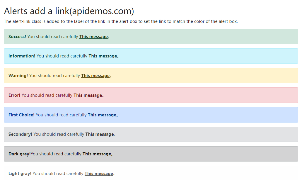
Alerts add a link
Add the alert-link class to the label of the link in the alert box to set the link to match the color of the alert box:
<!DOCTYPE html>
<html>
<head>
  <title>Bootstrap5 demos</title>
  <meta charset="utf-8">
  <meta name="viewport" content="width=device-width, initial-scale=1">
  <link href="https://cdn.staticfile.org/twitter-bootstrap/5.1.1/css/bootstrap.min.css" rel="stylesheet">
  <script src="https://cdn.staticfile.org/twitter-bootstrap/5.1.1/js/bootstrap.bundle.min.js"></script>
</head>
<body>

<div class="container mt-3">
  <h2>Alerts add a link(apidemos.com)</h2>
  <p>The alert-link class is added to the label of the link in the alert box to set the link to match the color of the alert box.</p>
  <div class="alert alert-success">
    <strong>Success!</strong> You should read carefully <a href="#" class="alert-link">This message</a>。
  </div>
  <div class="alert alert-info">
    <strong>Information!</strong> You should read carefully <a href="#" class="alert-link">This message</a>。
  </div>
  <div class="alert alert-warning">
    <strong>Warning!</strong> You should read carefully <a href="#" class="alert-link">This message</a>。
  </div>
  <div class="alert alert-danger">
    <strong>Error!</strong> You should read carefully <a href="#" class="alert-link">This message</a>。
  </div>
  <div class="alert alert-primary">
    <strong>First Choice!</strong> You should read carefully <a href="#" class="alert-link">This message</a>。
  </div>
  <div class="alert alert-secondary">
    <strong>Secondary!</strong> You should read carefully <a href="#" class="alert-link">This message</a>。
  </div>
  <div class="alert alert-dark">
    <strong>Dark grey!</strong>You should read carefully <a href="#" class="alert-link">This message</a>。
  </div>
  <div class="alert alert-light">
    <strong>Light gray!</strong> You should read carefully <a href="#" class="alert-link">This message</a>。
  </div>
</div>

</body>
</html>
Output:
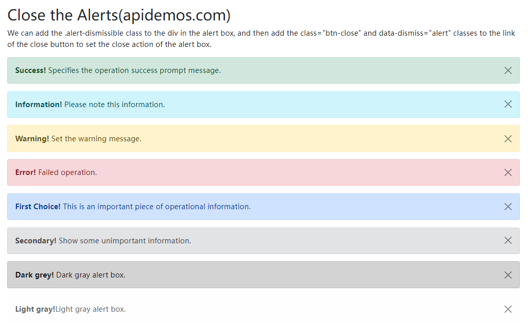
Close the Alerts
We can add .alert-dismissible class to the div in the alert box, and then add class="btn-close " and data-dismiss="alert " classes to the link of the close button to set the close action of the alert box.
<!DOCTYPE html>
<html>
<head>
  <title>Bootstrap5 demos</title>
  <meta charset="utf-8">
  <meta name="viewport" content="width=device-width, initial-scale=1">
  <link href="https://cdn.staticfile.org/twitter-bootstrap/5.1.1/css/bootstrap.min.css" rel="stylesheet">
  <script src="https://cdn.staticfile.org/twitter-bootstrap/5.1.1/js/bootstrap.bundle.min.js"></script>
</head>
<body>

<div class="container mt-3">
  <h2>Close the Alerts(apidemos.com)</h2>
  <p>We can add the .alert-dismissible class to the div in the alert box, and then add the class="btn-close" and data-dismiss="alert" classes to the link of the close button to set the close action of the alert box.</p>
  <div class="alert alert-success alert-dismissible">
    <button type="button" class="btn-close" data-bs-dismiss="alert"></button>
    <strong>Success!</strong> Specifies the operation success prompt message.
  </div>
  <div class="alert alert-info alert-dismissible">
    <button type="button" class="btn-close" data-bs-dismiss="alert"></button>
    <strong>Information!</strong> Please note this information.
  </div>
  <div class="alert alert-warning alert-dismissible">
    <button type="button" class="btn-close" data-bs-dismiss="alert"></button>
    <strong>Warning!</strong> Set the warning message.
  </div>
  <div class="alert alert-danger alert-dismissible">
    <button type="button" class="btn-close" data-bs-dismiss="alert"></button>
    <strong>Error!</strong> Failed operation.
  </div>
  <div class="alert alert-primary alert-dismissible">
    <button type="button" class="btn-close" data-bs-dismiss="alert"></button>
    <strong>First Choice!</strong> This is an important piece of operational information.
  </div>
  <div class="alert alert-secondary alert-dismissible">
    <button type="button" class="btn-close" data-bs-dismiss="alert"></button>
    <strong>Secondary!</strong> Show some unimportant information.
  </div>
  <div class="alert alert-dark alert-dismissible">
    <button type="button" class="btn-close" data-bs-dismiss="alert"></button>
    <strong>Dark grey!</strong> Dark gray alert box.
  </div>
  <div class="alert alert-light alert-dismissible">
    <button type="button" class="btn-close" data-bs-dismiss="alert"></button>
    <strong>Light gray!</strong>Light gray alert box.
  </div>
</div>

</body>
</html>
Output:
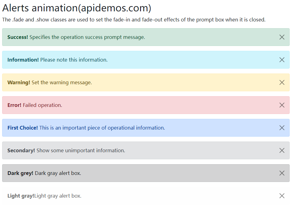
Alerts animation
The .fade and .show classes are used to set the fade-in and fade-out effects of the prompt box when it is closed.:
<!DOCTYPE html>
<html>
<head>
  <title>Bootstrap5 demos</title>
  <meta charset="utf-8">
  <meta name="viewport" content="width=device-width, initial-scale=1">
  <link href="https://cdn.staticfile.org/twitter-bootstrap/5.1.1/css/bootstrap.min.css" rel="stylesheet">
  <script src="https://cdn.staticfile.org/twitter-bootstrap/5.1.1/js/bootstrap.bundle.min.js"></script>
</head>
<body>

<div class="container mt-3">
  <h2>Alerts animation(apidemos.com)</h2>
  <p>The .fade and .show classes are used to set the fade-in and fade-out effects of the prompt box when it is closed.</p>
  <div class="alert alert-success alert-dismissible fade show">
    <button type="button" class="btn-close" data-bs-dismiss="alert"></button>
    <strong>Success!</strong> Specifies the operation success prompt message.
  </div>
  <div class="alert alert-info alert-dismissible fade show">
    <button type="button" class="btn-close" data-bs-dismiss="alert"></button>
    <strong>Information!</strong> Please note this information.
  </div>
  <div class="alert alert-warning alert-dismissible fade show">
    <button type="button" class="btn-close" data-bs-dismiss="alert"></button>
    <strong>Warning!</strong> Set the warning message.
  </div>
  <div class="alert alert-danger alert-dismissible fade show">
    <button type="button" class="btn-close" data-bs-dismiss="alert"></button>
    <strong>Error!</strong> Failed operation.
  </div>
  <div class="alert alert-primary alert-dismissible fade show">
    <button type="button" class="btn-close" data-bs-dismiss="alert"></button>
    <strong>First Choice!</strong> This is an important piece of operational information.
  </div>
  <div class="alert alert-secondary alert-dismissible fade show">
    <button type="button" class="btn-close" data-bs-dismiss="alert"></button>
    <strong>Secondary!</strong> Show some unimportant information.
  </div>
  <div class="alert alert-dark alert-dismissible fade show">
    <button type="button" class="btn-close" data-bs-dismiss="alert"></button>
    <strong>Dark grey!</strong> Dark gray alert box.
  </div>
  <div class="alert alert-light alert-dismissible fade show">
    <button type="button" class="btn-close" data-bs-dismiss="alert"></button>
    <strong>Light gray!</strong>Light gray alert box.
  </div>
</div>

</body>
</html>
Output: